Impress Training
PowerPoint | Impress | Resources
Impress is free presentation software that is a part of Open Office. It is an excellent alternative to Microsoft products and runs on a wider range of operating systems. It has a number of advantages including, Flash Export, better drawing tools and easy PDF creation.
ContentsDesigning a Good Presentation With Impress |
Designing a Good Presentation with Impress
I teach students and teachers to use Impress a lot and the same old problems keep on coming up. So here's my 5 step guide to designing an effective presentation.
1. Number of slides
Educational Presentations
If you are going to be giving a lecture to students, then its fine to have a large number of slides, but generally speaking you should be spending between 2-4 minutes per slide and NEVER less than 1 minute per slide.
Sales Presentations
If on the other hand you are making a Sales Presentation, I'd limit yourself to six slides. If you can't sell yourself in six slides then you'll never be able to sell yourself. Most sales books will tell you, that you've got about 5 minutes max to get a client's attention.
After the six slides you might then want to get into individual benefits or product slides at the client's request. Use Impress Hyperlinks to get you from one part of the presentation to the next.
2. The Text
How much?
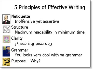
The short answer is as little as possible...Generally if somebody can read the Impress and understand the presentation without any further help, then it's too much text. Many trainers talk of the use of slogans, but to define that a little more:
Simple Slides
|
Should you reveal line by line or all at once... Well there's a big debate and my view is that if you have a big surprise in the text then don't show your hand! Otherwise I'd show all points it gives both the presenter and audience an indication of the flow of the presentation.
Tables
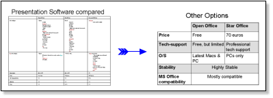
If using tables, be warned they can be very difficult to handle in Impress and very rarely produce visually impressive results, but sometimes a table is the best way to present comparisons usefully. If that's the case limit the table to 3 columns and 6 rows, don't be afraid to merge cells and colour the background in alternate cells to make it easier for your audience to read line by line.

For graphs I'd suggest you type your data into Calc and then copy and paste the graph into Impress. This is much better than Excel because what you see in Calc is what you will get in Impress.
English Learners: Don't worry that you can't read directly off the slides, you can use the notes function at the bottom of the slide to provide complete sentences if needed, while learning the presentation.
Good colours
Dark blue and yellow text work well in, black and white work well either way, but make sure colours VERY clearly contrast! And NEVER put strong background images in, if you want an image background either whitewash it or darken it so that it is very easy to tell apart from the text.
Remember: Projectors do NOT display images as well as your monitor.
3. Graphics
In simple terms, if you're going to talk about the diagram in your presentation then its an asset, if it's just there to make your slide pretty then its a liability. An old boss of mine used to say that every presentation needs to have one killer-image that people will remember. Even if that image takes you longer than the rest of the presentation it is time well spent.
Designing Graphics
You can design very effective graphics in directly in Impress. One particularly powerful feature is connectors, which make drawing flowcharts and hierarchy diagrams much easier. You can also get clipart and images from:
- use Open Clipart to assist with basic drawings
- Use Google Images to try and find the specific image you want.
Using Thumbnails

Thumbnails can be useful navigational items for training Presentations, because they provide a quick visual reference for students to see what aspect of the subject the lecturer is referring to.
4. Multimedia Content
- If you're using QuickTime then Impress is great, because it is fully supported
- Windows Media files are NOT supported and would need to be converted before being used in Impress and AVI files are only partially supported.
- Impress supports a number of other formats including MPEG, which will be familiar to technical users.
I'd suggest downloading a convertor program such as: Super to enable you to play and convert most kinds of videos. (The Website is a dog to navigate, use the Find function on the word download and eventually you will get there.)
Also if you plan to present with a different computer, please ensure that you bring the Movie file with you. It is best if they are kept in the same directory as the original file. (You may need to insert the video clip again, so please check on the target computer)
5. Front Page
In many cases the front slide will be shown before your presentation and this is a great opportunity to get the audience excited about what you are going to say, make sure your frontpage has:
- The name of the presentation clearly displayed
- Your name clearly displayed
- An interesting visual image relevant to the presentation or somekind of teaser.
6. Handouts
If people get handouts at the beginning of the presentation, why do they need to listen to you? Many people tell their audience they'll be getting handouts at the end and with attentive audiences this is quite acceptable, but not everybody will pay attention when they know they'll be getting notes...
Also, for sales and marketing Presentations, wouldn't the notes be an incentive for people to give you their Email addresses? So that you can send them a copy...
You've now designed your Impress Slides, now you can deliver your speech!

