PowerPoint Training
PowerPoint | Impress | Resources
PowerPoint is the Presentation software provided in Microsoft Office and is available on most office PCs, because it is installed on most PCs Presentations should be fairly portable.
ContentsDesigning a Good Presentation With PowerPoint |
Designing a Good Presentation with PowerPoint
I teach students and teachers to use PowerPoint a lot and the same old problems keep on coming up. So here's my 5 step guide to designing an effective presentation.
1. Number of slides
Educational Presentations
If you are going to be giving a lecture to students, then its fine to have a large number of slides, but generally speaking you should be spending between 2-4 minutes per slide and NEVER less than 1 minute per slide.
Sales Presentations
If on the other hand you are making a Sales Presentation, I'd limit yourself to six slides. If you can't sell yourself in six slides then you'll never be able to sell yourself. Most sales books will tell you, that you've got about 5 minutes max to get a client's attention.
After the six slides you might then want to get into individual benefits or product slides at the client's request. Use PowerPoint Hyperlinks to get you from one part of the presentation to the next.
2. The Text
How much?
The short answer is as little as possible...Generally if somebody can read the PowerPoint and understand the presentation without any further help, then it's too much text. Many trainers talk of the use of slogans, but to define that a little more:
Simple Slides
|
Should you reveal line by line or all at once... Well there's a big debate and my view is that if you have a big surprise in the text then don't show your hand! Otherwise I'd show all points it gives both the presenter and audience an indication of the flow of the presentation.
Tables
If using tables, be warned they can be very difficult to handle in PowerPoint and very rarely produce visually impressive results, but sometimes a table is the best way to present comparisons usefully. If that's the case limit the table to 3 columns and 6 rows, don't be afraid to merge cells and colour the background in alternate cells to make it easier for your audience to read line by line.
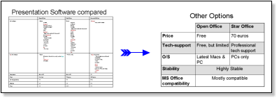
For figure work it is nearly always better to work in Excel and then copy and paste the results into PowerPoint. In the example below I changed a table into an organisation chart, which reinforces the point much more effectively.
English Learners: Don't worry that you can't read directly off the slides, you can use the notes function at the bottom of the slide to provide complete sentences if needed, while learning the presentation.
Good colours
Dark blue and yellow text work well in, black and white work well either way, but make sure colours VERY clearly contrast! And NEVER put strong background images in, if you want an image background either whitewash it or darken it so that it is very easy to tell apart from the text.
Remember: Projectors do NOT display images as well as your monitor.
3. Graphics
In simple terms, if you're going to talk about the diagram in your presentation then its an asset, if it's just there to make your slide pretty then its a liability. An old boss of mine used to say that every presentation needs to have one killer-image that people will remember. Even if that image takes you longer than the rest of the presentation it is time well spent.
Designing Graphics
The ideal graphic is one specifically made for the presentation by a professional. Failing that consider the following options:
- For numeric information, use Excel to create graphs and then copy and paste them into your PowerPoint. (Excel has much better control over graphs than PowerPoint)
- Use the insert -> diagram option to make semi-customised content.
- Use Google Images to try and find the specific image you want.
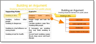
- Use the drawing toolbar to combine your images effectively. (See image below)

Combines a number of standard images to make a new diagram
Using Thumbnails
Thumbnails can be useful navigational items for training Presentations, because they provide a quick visual reference for students to see what aspect of the subject the lecturer is referring to.
4. Multimedia Content
Generally speaking I try to avoid multimedia content and unless you are highly technically adept, I'd advise against using any kind of sound or videos in your presentation. Be aware of the following pitfalls:
- Linked files do not transfer well from one PC to another. The best method to make presentations portable is to use the package for CD option.
- Check your audio before giving the presentation and make sure you take all the required cables. (Plan B, one presentation with sound and one without)
- NEVER assume you can use the Internet during a presentation. It's always best to ensure all content is on your PC.
- Make sure you use the same version of PowerPoint on both PCs. (If you can't check your presentation carefully before giving it.)
- Don't use more than one fade and more than one transition per slideshow, unless this is going to be used in a kiosk, you want the speaker to be the focus of attention not the flashing graphics.
5. Front Page
In many cases the front slide will be shown before your presentation and this is a great opportunity to get the audience excited about what you are going to say, make sure your frontpage has:
- The name of the presentation clearly displayed
- Your name clearly displayed
- An interesting visual image relevant to the presentation or somekind of teaser.
6. Handouts
If people get handouts at the beginning of the presentation, why do they need to listen to you? Many people tell their audience they'll be getting handouts at the end and with attentive audiences this is quite acceptable, but not everybody will pay attention when they know they'll be getting notes...
Also, for sales and marketing Presentations, wouldn't the notes be an incentive for people to give you their Email addresses? So that you can send them a copy...
You've now designed your PowerPoint Slides, now you can deliver your speech!